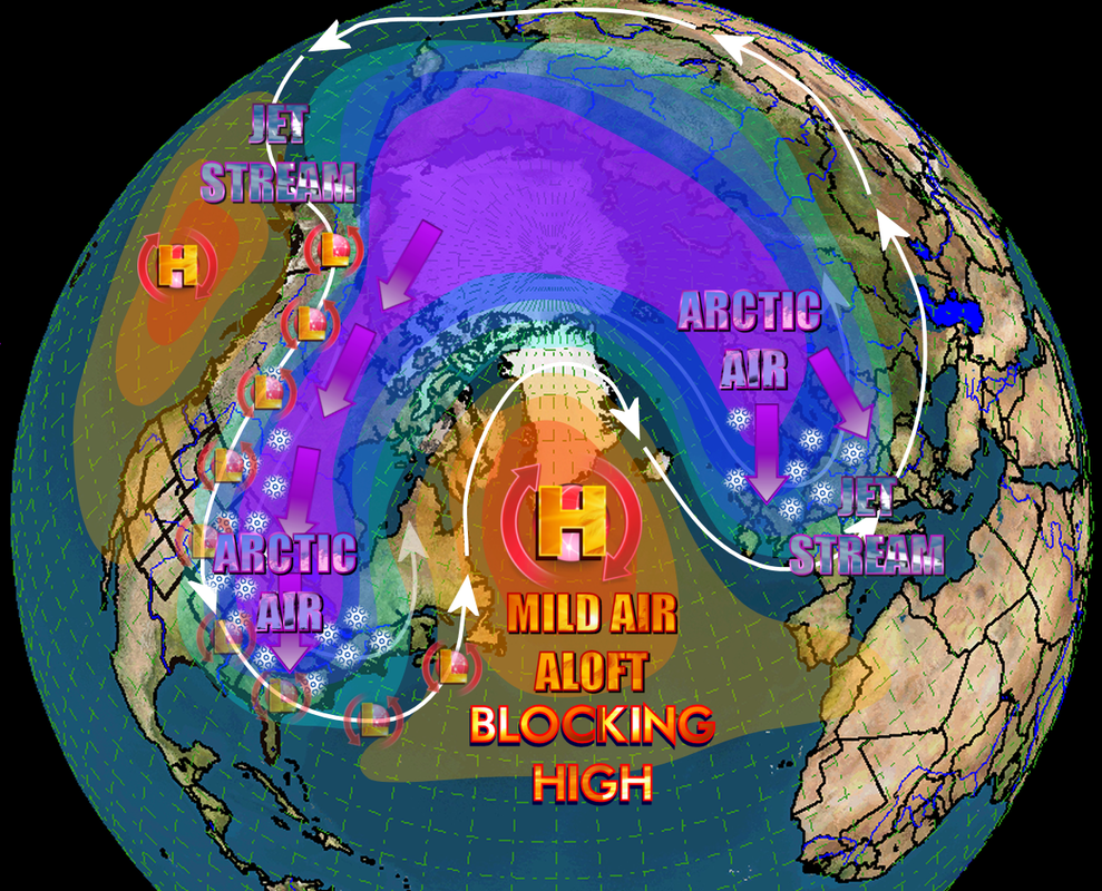
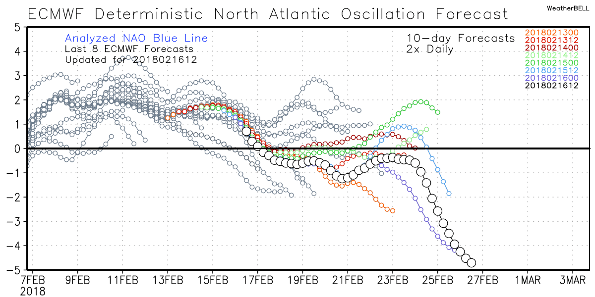
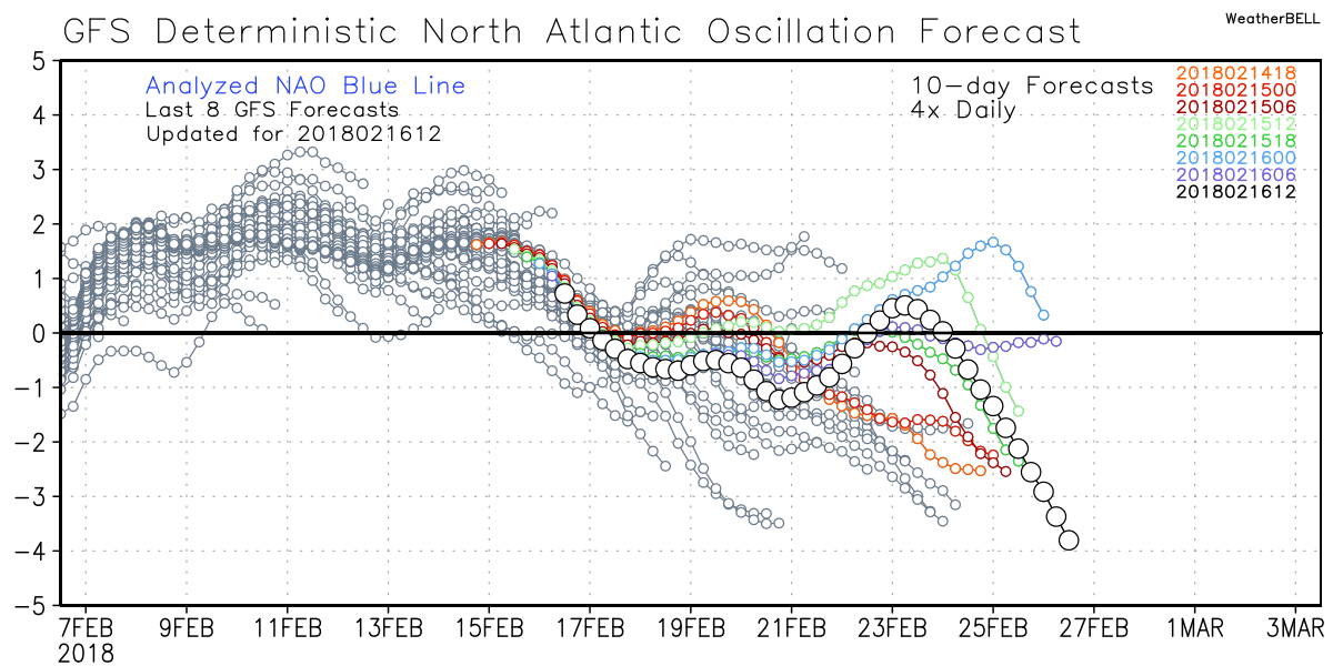
 Example of a Negative NAO - click to enlarge Example of a Negative NAO - click to enlarge All models are in very good agreement about the state of some very important teleconnections as we head toward the end of the month, and I wanted to show you some examples of what I'm talking about. The talk right now is how the NAO or North Atlantic Oscillation, is about to take a negative plunge. "The North Atlantic Oscillation (NAO) is a weather phenomenon in the North Atlantic Ocean of fluctuations in the difference of atmospheric pressure at sea level (SLP) between the Icelandic low and the Azores high." The negative phase of the NAO reflects above-normal heights and pressure across the high latitudes of the North Atlantic and below-normal heights and pressure over the central North Atlantic, the eastern United States and western Europe. The image above shows a NAO block. I'll first show you what the models are depicting and then I'll show you the analog results of that for February and March. You can thank the Sudden Stratospheric Warming event for he steep decline in the Arctic Oscillation (AO) and NAO values. We need a little more cooperation from the EPO or East Pacific Oscillation to add the icing on the cake. Or who knows... maybe white stuff on the ground? :-) The first two images are the Euro and GFS operational models from the 16th. The Euro is diving off the charts negative with the GFS not far behind.
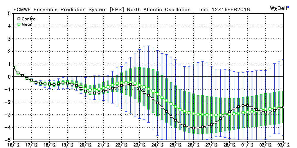
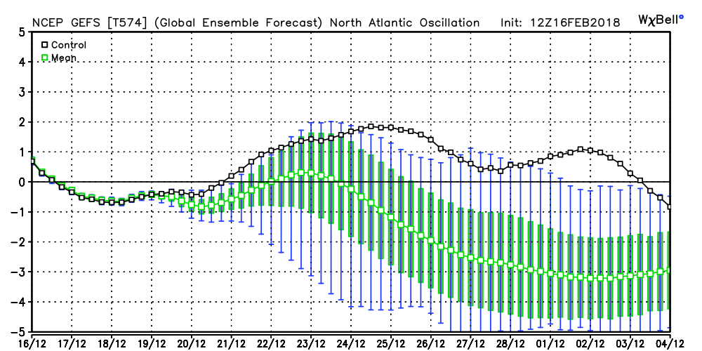
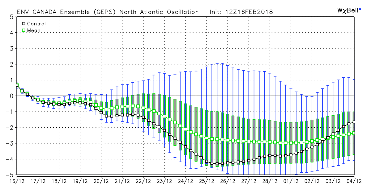
The images below are the ensemble runs of the three major models for the NAO. The darker line in each image is the control run, the center green line is the ensemble mean. The taller green bars show the spread of the ensemble members. As you can see, the ensemble members for all models agree on a very negative NAO in our near future.
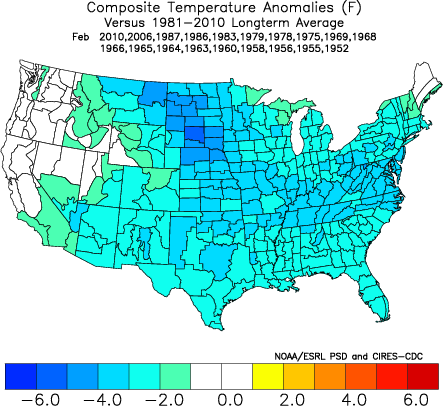
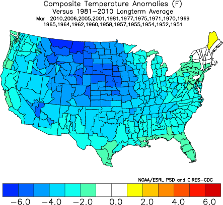
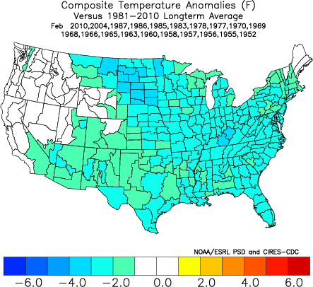
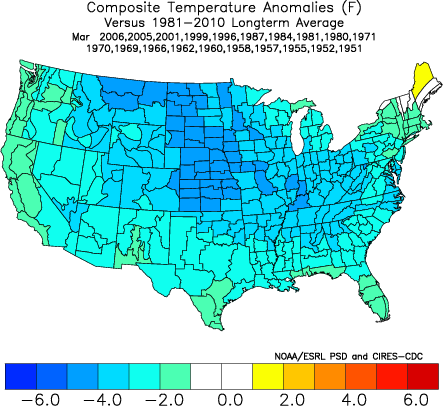
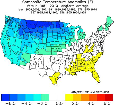
The images below show the "normal" temperature outcomes with a negative NAO in February (left) and March (right)
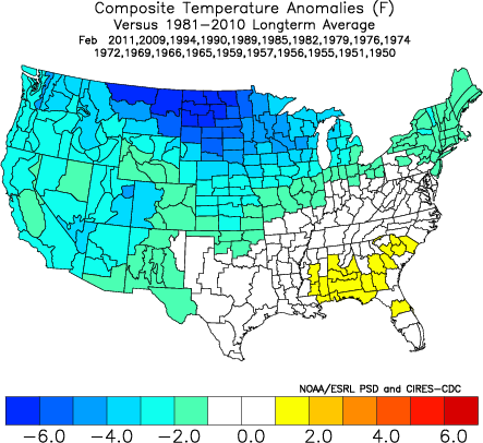
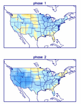
 Example of a Negative Arctic Oscillation - click to enlarge Example of a Negative Arctic Oscillation - click to enlarge As long as we're talking about the Arctic Oscillation, here's a broad brush look at an example of a negative AO. In the negative phase, the polar low pressure system (also known as the polar vortex) over the Arctic is weaker, which results in weaker upper level winds (the westerlies). The result of the weaker westerlies is that cold, Arctic air is able to push farther south into the U.S., while the storm track also remains farther south. The opposite is true when the AO is positive: the polar circulation is stronger which forces cold air and storms to remain farther north. The Arctic Oscillation often shares phase with the North Atlantic Oscillation (NAO), and its phases directly correlate with the phases of the NAO concerning implications on weather across the U.S. The two images below show the outcome of a negative AO for February (left) and March (right).
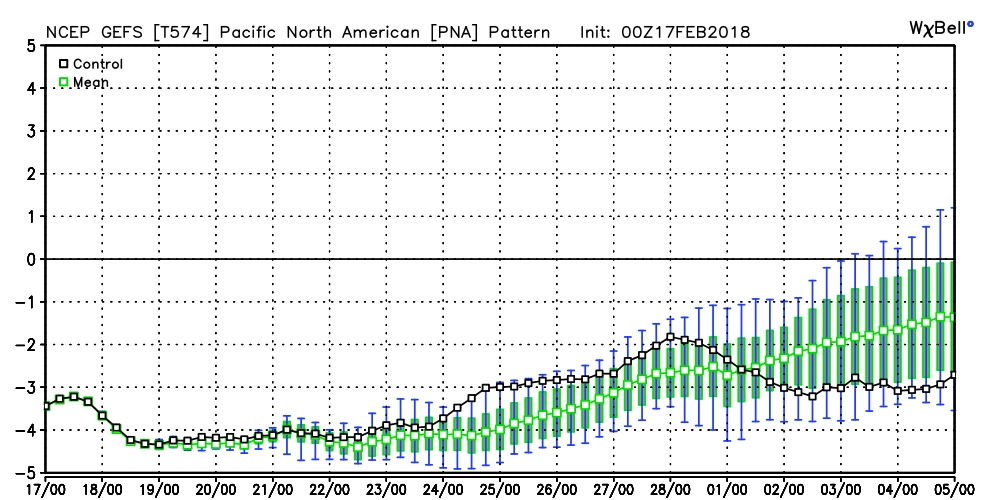
There are other teleconnections that aren't quite as favorable, and the PNA is one of those. Right now it's fairly deep in the negative range, and you can see from the two images to the right, that makes things a little warmer here at this time of year.
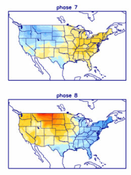
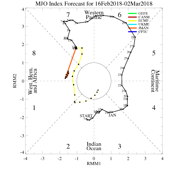 MJO all model mean MJO all model mean We've been stuck in Phase 7 of the MJO which is a warm phase for us at this time of the year, but it looks like it will start moving into Phase 8, 1, 2, even if only weakly. Phases 6 and 7 which we just went though are warm phases during the winter months, and the strength of the amplitude made things even worse. The 8, 1, 2 phases are cooler than the one we are currently in The combination of favorable high latitude blocking and the MJO should allow for the return of cold air for the month of March. The main concern will be how much Pacific air we get and how much the Bermuda ridge wants to flex its muscle.
Isn't winter fun in Georgia? Maybe some of you haven't really tracked winter storms here before, at least not in the detail that I track them, and you have now experienced the roller coaster ride that brought us our winter weather on Friday and Saturday. As you have seen, it certainly comes with it's share of highs and lows, and it sometimes ends up well and sometimes not at all. Those that saw snow are happy and those that didn't are very disappointed or even depressed, and I feel your pain. So here's my look at what went wrong. These are simply my thoughts and opinions about what happened and what could have been done differently. This is NOT a dissection of the storm itself, but instead a look at what could have been done to better communicate timely changes to the forecast. I do know that after the fact armchair quarterbacking is much easier than coming up with the actual forecast, and I do not claim to be able to do better... the NWS guys are the experts and they had their reasons for what they forecasted and why. I just thought that I would look at this from an outsiders point of view and try to make some sense of the communication process that led up to the storm. I'm hoping that the NWS will have more to add as they review what happened. First, and I want to emphasize this, I do not in anyway place any blame on the meteorologists at the Atlanta NWS office. These ladies and gentlemen are among the best in their field and we are very lucky to have them working in our NWS office. They are thorough and focused on their mission to provide the finest weather forecast anywhere. My hat goes off to them for the hard work that went into this storm event and the long shifts (almost left out the "f" :-) ) they had to endure. I've said this over and over but I'll say it again, forecasting snow in the southeast is one of the most difficult and demanding jobs there is, and I don't envy anyone having to make that forecast. Based on comments from people like you, it seems as though you can summarize the thoughts about how you feel down to a few words and phrases: "Bust", "Hype", "Cry wolf", and "won't believe next time". Some people are even angry. As a meteorologist, I'm sure those words have to sting a little, and it's not something that they ever want to hear, but I also know they will be going back and analyze and re-evalute their own performance and what they could have done better from their perspective. So why do people feel the way they do, and what could have been done differently to help prevent all of the anguish to start with?
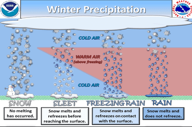
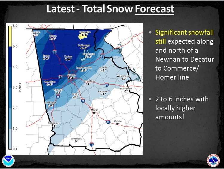
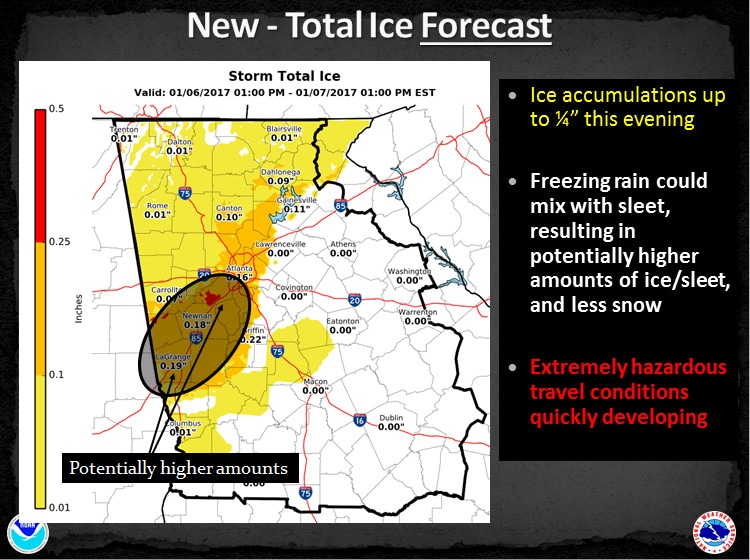
SnowThe atmosphere is very moist as indicated by the small amount of separation between the air temperature (red line) and the dew point (blue line). Even though the air temperature increases a few hundred feet above the ground (a temperature inversion) the air temperature, throughout the entire atmosphere, remains below freezing. So, when precipitation begins, it will be in the form of snow and will remain frozen as snowflakes reaching the ground. 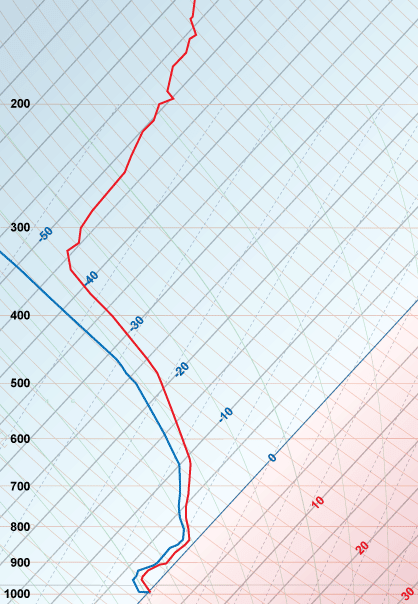 A typical "Snow" sounding. SleetAs with the previous sounding, the atmosphere is very moist. So much so, the air temperature and dew point are the same from near 900 millibars (3,000 ft. / 1,000 m) to a little above 700 millibars (10,000 ft. / 3,000 m). At the surface, an arctic cold front had moved south of the observation station with an air temperature well below freezing. The air temperature begins to decrease with height (which is normal) dropping from 23°F to 12°F (-5°C to -11°C). However, the density of the arctic air is such that it lays close to the ground with its vertical extent fairly small, in this case only about 3,000 feet (1,000 meters) deep. Above 900 millibars (3,000 ft. / 1,000 m) the air becomes considerably warmer. This area is called an inversion, where temperature change with height is 'inverted' as it increases with height instead of typically decreasing with height. This inversion is often also referred as a 'warm nose'. Eventually, the temperature of the atmosphere will return to the typical decrease with height (near 800 mb) and will continue to cool until it falls to below freezing again (about 720 mb). While there may be some precipitation forming as rain in the warm 'nose' region where the air temperature is above freezing, the vast majority of precipitation will form as snow in the colder below freezing air above the inversion. As snow falls into the 'warm nose', it melts into a liquid drop/rain. Then the liquid drops fall back into the arctic air mass (near the ground) that is cold enough and deep enough for the liquid to freeze into ice pellets before reaching the ground. 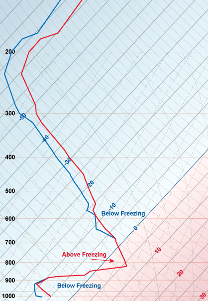 A typical "Sleet" sounding. Freezing RainThe basic pattern for freezing rain is similar to ice pellets. The main difference is the cold, dense air near the surface is very shallow and/or the 'warm nose' is large or very warm or both. The melted snow does not have sufficient time to freeze before is reaches the ground. Therefore, precipitation falls as rain but then it freezes upon contact with a surface such as a tree, power line, automobile or bridge. As a general rule, elevated surfaces will ice first because the ground cannot keep them warm, allowing them to cool to the air temperature quickly. This allows the rain to freeze to ice on contact with these surfaces. Elevated surfaces may be capable of accumulating ice as soon as the air temperature falls below 32°F (0°C). Road surfaces in contact with the ground will generally begin to ice when the air temperature falls to 28°F (-2°C). 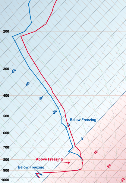 A typical "Freezing Rain" sounding. Forecast TimelineI'd like to first look at the forecast timeline and see how the forecast evolved from start to finish. This slideshow starts on the 4th and ends on the 6th. Even at 10:34 PM while the storm was underway, the official forecast graphic was still showing snow for most people, when it was already apparent that the snow wasn't coming for many. The 1 PM sounding on Friday the 6th, showed a significant warm nose that appeared to start at roughly 3000 feet and extend all the way to almost 10,000 feet, and even below 3000 feet, many of us were still above freezing. This sounding was taken after the first round of precip came though. 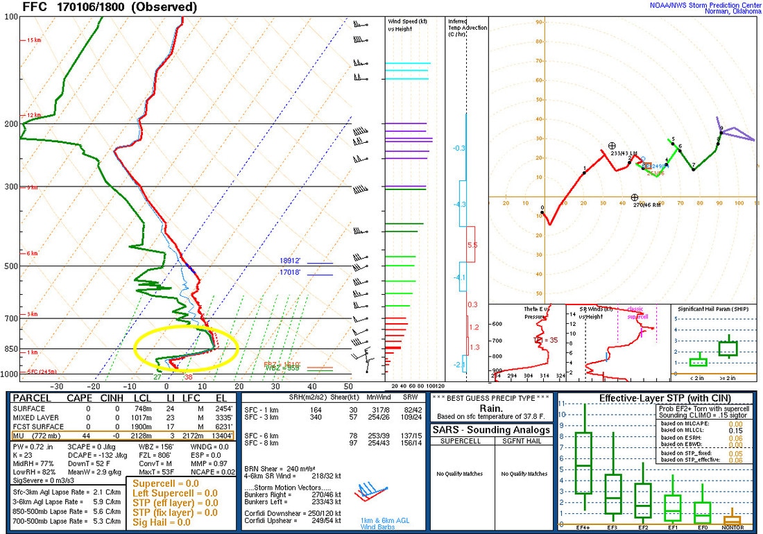 January 6, 1 PM sounding In addition to the warm nose, the flow of air around the mountains created a thermal ridge which helped keep warm air in place longer than expected. 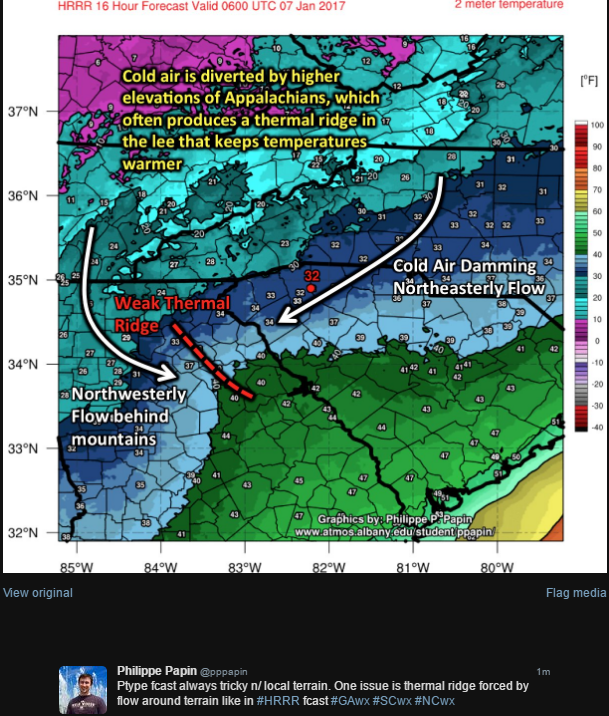 At 1 PM, the Atlanta NWS office lowered snow totals and produced this graphic. 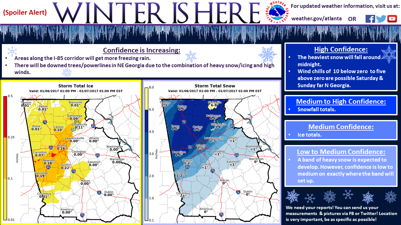 This next two graphics were included in the 4 pm weather briefing. This is just my opinion... in the snow forecast image, too much emphasis was placed on "Significant" snowfall", "higher amounts", and "2-6" with locally higher amounts" and not enough on the decreasing chance for snow and the increasing chance for freezing rain or even nothing at all. At this point, everything had changed and it was becoming very apparent that was a change for the worse, at least in terms of the original forecast. Optimisim was running high at this point and these slides helped to pertetuate the optimisim. Again, just my opinion, but some harse reality needed to be expressed to the general population to prepare them for what wasn't coming.
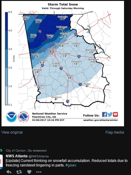 Finally, around 10:34 pm, the new graphics were posted, but it still didn't match the reality of what was going to happen. In my opinion, this is where the second mistake was made. By 10:34 pm, many people had already gone to bed, expecting to wake up to snow on the ground. While this map depicted pretty much what was going to happen, it was posted entirely too late to be of any real benifit for most people. I would have thought by this point that the snow totals for central Georgia would have been removed entirely but it stayed on the map.
There was discussion about the warm nose as early as 10 am on Friday, Knowing how winter weather in the south goes, I would have thought that the forecasted snow amounts would have decreased more rapidly than they did. The lingering snow forecast led to snow total expectations that would never materialize for many people, and I think that's the rub. When you have a snow forecast for 4 million+ people and it doesn't happen, you have a lot of people who start to dismiss the talk of any winter weather, which can end up being a dangerous way to think. This storm could have easily gone the other way and we would have been looking at a very large and dangerous mess, fortunately, most of us were spared. And that's the problem, forecasting snow in the southeast is more often a crap shoot at best, and a few degrees is the fine line we sometimes walk. So here are some great weather lessons that can be taken from this storm...
On to the next storm.... :-) |
Archives
March 2019
Categories
All
|
OLD NORTH GA WX BLOG
 RSS Feed
|
Never base important decisions on this or any weather information obtained from the Internet. Always have a backup method of receiving weather information such as a battery powered weather radio.
Copyright © 2018 NorthGeorgiaWX.com and DaculaWeather.com 
|